
Recent trailers for HBO’s “Harry Potter” and Disney’s live action “Moana” have left audiences wondering where the magic of movies has gone. These beloved stories are being retold in hopes to expand the fanbase and overall story, but they’re sacrificing a very vital visual aspect—color grading.
The question of “where has all the color gone” has been circulating in corners of the internet since post-COVID-19 productions began to hit theatres; the conversation entered the mainstream with “Wicked” in 2024 when audiences noticed the lack of life Oz had when comparing it with “The Wizard of Oz.”
What is the cause of this gray-ification of the silver screen? Why does color matter so much to modern viewers and storytellers? It’s time for the tale of technicolor and color grading in film, before these elements become something of myth.
Ruby Red Slippers and Yellow Brick Roads
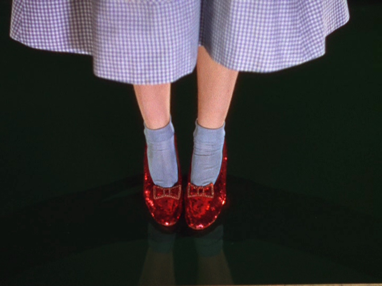
When people think of the term “technicolor,” they often think of golden age Hollywood movies and musicals—not the actual company, Technicolor Motion Picture Corporation. They were responsible for the iconic oversaturation of films in the early 20th century. The Technicolor process differed over the years as film was still evolving from just “motion pictures” to full-length, color productions; the most famous technique was “Three-Strip Technicolor.”
According to No Film School, the three-strip technique was done using a specialized camera that was able to individually expose three strips of black and white film, each to capture primary film color (red, green, and blue). These three strips were then combined into the full-color image that allows you to see Dorothy in her ruby slippers and blue gingham dress skipping along the yellow brick road.
Not only did this classic film technique impact the visual value of a film, but by being able to isolate and emphasize specific shades, it also informed the audience of important themes and symbolism throughout the story.
Nowadays, movies aren’t made on actual film strips anymore. The three-strip process and all others eventually became obsolete due to the digital age, leaving viewers to lament the lack of saturated colors. We don’t see true technicolor past the mid-1970s for the most part, but there are other modern day modes of making color monumental in movies.
The Undersaturated Market of Color Grading

While “color grading” may seem like a modern term and practice, it’s actually a process that’s been performed on films since before they were even in color. Color grading, similarly to technicolor, allows the filmmakers to connect with the audience through a visual language, rather than have everything explicitly in the dialogue.
Jet Omoshebi, a famous colorist who has worked on projects like “The Witcher” and “Underworld,” defines his role as “a translator between the filmmakers and their audience—to make sure no message is lost.”
Wes Anderson’s filmography is an excellent example of how color grading can completely alter a movie. Although his stories are constructed in “reality,” they seem fantastical due to the very specific color palette Anderson works with—usually pastels of yellow, pink and blue.
According to Film Supply, there are four major categories color grading tends to fall into: the blockbuster look, monochromes, Bleach Bypass and the classic black and white. The blockbuster look emphasizes teal and orange, these colors act as opposites, creating contrast that allows characters to pop. You can see this coloration in films like “Mad Max: Fury Road” or often in the Marvel Cinematic Universe.
Monochromes are exactly as they sound, selecting one color to emphasize; some examples include the blues of “Moonlight” or the greens of “The Matrix.” Think of any famous war movie, they probably use Bleach Bypass. The bleaching method is for a very unsaturated and desolate appearance, making it perfect for films like “Saving Private Ryan.”
All of these strategies can create an atmosphere for the audience to get wrapped up in, fully immersing them in the world of a film.
The Whole, Colorful Picture
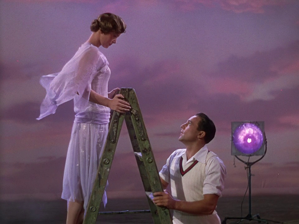
Although film began in black and white, it’s clear that current audiences crave color. The new standard of color grading shifting towards what many are calling either “Netflix lighting” or “commercial,” is deeper than missing some saturation, it’s isolating the audience from being able to connect with characters.
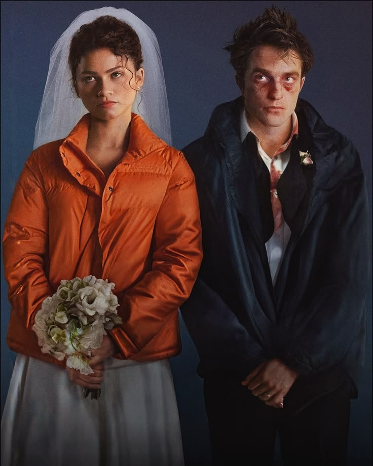
From “The Devil Wears Prada 2” to “Disclosure Day” each new film trailer feels the same as the last because the colors are flat and faded. Cinephiles don’t want cinema to look like the everyday world, they’re seeking to participate in another world for a brief time— not only to be transported, but to also be visually enthralled.
Color must remain a purposeful and powerful choice in film for the sake of art and audiences alike.
What are your thoughts on “Netflix lighting” and color grading? Let us know @VALLEYMag on Instagram or X!





Greetings! I know this is kind of off topic but I was wondering if you knew where I could get a captcha plugin for my comment form? I’m using the same blog platform as yours and I’m having trouble finding one? Thanks a lot!
I was very pleased to find this web-site.I wanted to thanks for your time for this wonderful read!! I definitely enjoying every little bit of it and I have you bookmarked to check out new stuff you blog post.
After study a few of the blog posts on your website now, and I truly like your way of blogging. I bookmarked it to my bookmark website list and will be checking back soon. Pls check out my web site as well and let me know what you think.
I am so happy to read this. This is the kind of manual that needs to be given and not the random misinformation that’s at the other blogs. Appreciate your sharing this best doc.
Deference to website author, some excellent entropy.
I’m no longer sure the place you’re getting your info, but good topic. I needs to spend some time learning more or working out more. Thanks for fantastic info I used to be in search of this info for my mission.
An impressive share, I just given this onto a colleague who was doing a little analysis on this. And he in fact bought me breakfast because I found it for him.. smile. So let me reword that: Thnx for the treat! But yeah Thnkx for spending the time to discuss this, I feel strongly about it and love reading more on this topic. If possible, as you become expertise, would you mind updating your blog with more details? It is highly helpful for me. Big thumb up for this blog post!
Its like you read my mind! You appear to know so much about this, like you wrote the book in it or something. I think that you could do with a few pics to drive the message home a bit, but other than that, this is fantastic blog. A fantastic read. I will definitely be back.
As a Newbie, I am permanently searching online for articles that can help me. Thank you
I just couldn’t depart your website prior to suggesting that I extremely enjoyed the standard info a person provide for your visitors? Is gonna be back often to check up on new posts